
Why atomic pattern?
이전에 관리자 페이지를 만들면서 아토믹 패턴을 변형한 atom, block, page 3단 구조의
독자적인 디자인 패턴으로 프런트 엔드 코드를 작성해 보았는데 장점과 단점은 다음과 같았다.
| 장점 | 단점 |
| 빠른 코드 작성 | page가 비대해짐 |
| 일관된 디자인의 코드 작성 가능 | 커스터마이징이 힘듦 |
| 코드의 구조화 |
프런트엔드 개발자가 아니기에 최대한 빠르고 일관되게 페이지를 작성할 필요가 있었고,
일관되고 구조적인 코드를 짜면서, 특정 부분(이전에는 page에서 모든 디자인을 한번에 했다)의 비대화를 막기 위해
아토믹 패턴의 변형이 아닌 best practice로 프런트엔드 코드를 작성하기로 했다.
How to make it? - atoms
1. 기능의 최소 단위로 분리한다.
Button, Link, Title, Subtitle 등 "기능"별로 분리할 수 있는 최소한의 단위로 요소를 나누어 공통의 디자인을 구현한다.
2부터는 Button을 예시로 들어 설명한다.
2. 코드의 "공통" 디자인 부분을 theme, size 등으로 미리 정의한다.
typescript를 사용하면 조금 더 보기 좋은 코드를 만들 수 있다.
tainwindCSS를 사용하기 때문에 className에 들어갈 디자인은 string 형태로 지정한다.
어떤 타입의 버튼일지, 색상은 어떻게 할지, 사이즈는 어떻게 할지를 미리 정해놓아 일관된 디자인을 만든다.
export const ButtonType = {
  BUTTON: 'button',
  RESET: 'reset',
  SUBMIT: 'submit',
} as const;
type ButtonTypeKeys = (typeof ButtonType)[keyof typeof ButtonType];

export const ButtonTheme = {
  DEFAULT: 'bg-blue-500 hover:bg-blue-600 text-white rounded',
  WARNING: 'bg-red-500 hover:bg-red-600 text-white rounded',
} as const;
type ButtonThemeKeys = (typeof ButtonTheme)[keyof typeof ButtonTheme];

export const ButtonSize = {
  SMALL: 'px-2 py-1 text-sm',
  MEDIUM: 'px-4 py-2',
  LARGE: 'px-6 py-3 text-lg',
} as const;
type ButtonSizeKeys = (typeof ButtonSize)[keyof typeof ButtonSize];
3. Interface를 정의한다.
Button에 필요한 요소라고 생각되는 부분(onClick 등)과 지정해둔 type, size, theme 등을 기반으로 interface를 만든다.
interface Props {
  children: React.ReactNode;
  className?: string;
  onClick: () => void;
  type: ButtonTypeKeys;
  theme: ButtonThemeKeys;
  size: ButtonSizeKeys;
}
4. Props의 default value를 정의 해준다.
type, theme, size 등이 Props를 통해 들어오지 않았을 때의 기본값을 넣어준다.
const Button: React.FC<Props> = ({
  onClick,
  children,
  className = '',
  type = ButtonType.BUTTON,
  theme = ButtonTheme.DEFAULT,
  size = ButtonSize.MEDIUM,
}) => {...}
5. atom을 구현 한다.
const tailwindStyle이라는 새로운 string을 만들어 새로 들어오는 className과 기존에 지정해둔 css를 함께 사용할 수 있도록 만들었다.
const Button: React.FC<Props> = ({
  onClick,
  children,
  className = '',
  type = ButtonType.BUTTON,
  theme = ButtonTheme.DEFAULT,
  size = ButtonSize.MEDIUM,
}) => {
  const tailwindStyle = `${theme} ${size} ${className}`;
  return (
    <button onClick={onClick} className={tailwindStyle} type={type}>
      {children}
    </button>
  );
};

export default Button;
6. Button 완성
import React from 'react';

export const ButtonType = {
  BUTTON: 'button',
  RESET: 'reset',
  SUBMIT: 'submit',
} as const;
type ButtonTypeKeys = (typeof ButtonType)[keyof typeof ButtonType];

export const ButtonTheme = {
  DEFAULT: 'bg-blue-500 hover:bg-blue-600 text-white rounded',
  WARNING: 'bg-red-500 hover:bg-red-600 text-white rounded',
} as const;
type ButtonThemeKeys = (typeof ButtonTheme)[keyof typeof ButtonTheme];

export const ButtonSize = {
  SMALL: 'px-2 py-1 text-sm',
  MEDIUM: 'px-4 py-2',
  LARGE: 'px-6 py-3 text-lg',
} as const;
type ButtonSizeKeys = (typeof ButtonSize)[keyof typeof ButtonSize];

interface Props {
  children: React.ReactNode;
  className?: string;
  onClick: () => void;
  type: ButtonTypeKeys;
  theme: ButtonThemeKeys;
  size: ButtonSizeKeys;
}

const Button: React.FC<Props> = ({
  onClick,
  children,
  className = '',
  type = ButtonType.BUTTON,
  theme = ButtonTheme.DEFAULT,
  size = ButtonSize.MEDIUM,
}) => {
  const tailwindStyle = `${theme} ${size} ${className}`;
  return (
    <button onClick={onClick} className={tailwindStyle} type={type}>
      {children}
    </button>
  );
};

export default Button;
How to make it? - molecules
기능별로 분리된 atoms이 있다면 잘 조합하는 것으로 molecules를 만들 수 있다.
Button.tsx
import React from 'react';

export const ButtonType = {
  BUTTON: 'button',
  RESET: 'reset',
  SUBMIT: 'submit',
} as const;
type ButtonTypeKeys = (typeof ButtonType)[keyof typeof ButtonType];

export const ButtonTheme = {
  DEFAULT: 'bg-blue-500 hover:bg-blue-600 text-white rounded',
  WARNING: 'bg-red-500 hover:bg-red-600 text-white rounded',
} as const;
type ButtonThemeKeys = (typeof ButtonTheme)[keyof typeof ButtonTheme];

export const ButtonSize = {
  SMALL: 'px-2 py-1 text-sm',
  MEDIUM: 'px-4 py-2',
  LARGE: 'px-6 py-3 text-lg',
} as const;
type ButtonSizeKeys = (typeof ButtonSize)[keyof typeof ButtonSize];

interface Props {
  children: React.ReactNode;
  className?: string;
  onClick: () => void;
  type: ButtonTypeKeys;
  theme: ButtonThemeKeys;
  size: ButtonSizeKeys;
}

const Button: React.FC<Props> = ({
  onClick,
  children,
  className = '',
  type = ButtonType.BUTTON,
  theme = ButtonTheme.DEFAULT,
  size = ButtonSize.MEDIUM,
}) => {
  const tailwindStyle = `${theme} ${size} ${className}`;
  return (
    <button onClick={onClick} className={tailwindStyle} type={type}>
      {children}
    </button>
  );
};

export default Button;Link.tsx
import React from 'react';
import { default as NextLink } from 'next/link';

export const LinkTheme = {
  DEFAULT: 'text-gray-600 text-lg pl-4 py-2 rounded-lg',
  LOGO: 'text-gray-600 text-3xl rounded-lg',
} as const;
type LinkThemeKeys = (typeof LinkTheme)[keyof typeof LinkTheme];

interface Props {
  children: React.ReactNode;
  className?: string;
  href: string;
  theme: LinkThemeKeys;
}

/**
 * This has the same name as 'next/link',
 * but make sure to import it from '@/atoms/Link
 */
const Link: React.FC<Props> = ({
  children,
  className = '',
  href = '',
  theme = LinkTheme.DEFAULT,
}) => {
  const tailwindStyle = `${theme} ${className}`;
  return (
    <NextLink href={href} className={tailwindStyle}>
      {children}
    </NextLink>
  );
};

export default Link;Button과 Link를 조합하여 Header(navbar)를 만들었다. molecules 단위에서 디자인을 지정해 주어야 이후 page에서 지저분하게 css가 늘어나지 않는다.
props drilling을 통해 atoms에 필요한 요소들을 내려준다.
import React from 'react';
import Link, { LinkTheme } from '@atoms/Link';
import Button, { ButtonSize, ButtonTheme, ButtonType } from '@atoms/Button';
import { useLoginStore } from '@/stores/login';

interface Props {}

const Header: React.FC<Props> = () => {
  /**
   * Mind that this function only re-renders Header.tsx
   */
  const { isLoggedIn, login, logout } = useLoginStore();
  const logginToggle = isLoggedIn ? logout : login;
  return (
    <header>
      <nav className="h-navbar bg-white shadow-md relative">
        <div className="mx-4 py-3 align-middle">
          <div className="flex items-center justify-between">
            <div className="mr-10">
              {/* Change to image later */}
              <Link href="/" theme={LinkTheme.LOGO}>
                Dev-Aid
              </Link>
            </div>
            <div className="flex justify-between items-center flex-grow">
              <div>
                <Link href="/content" theme={LinkTheme.DEFAULT}>
                  content
                </Link>
                <Link href="/content" theme={LinkTheme.DEFAULT}>
                  content
                </Link>
                <Link href="/content" theme={LinkTheme.DEFAULT}>
                  content
                </Link>
                <Link href="/content" theme={LinkTheme.DEFAULT}>
                  content
                </Link>
              </div>
              <Button
                onClick={() => {
                  logginToggle();
                }}
                type={ButtonType.BUTTON}
                theme={ButtonTheme.DEFAULT}
                size={ButtonSize.MEDIUM}
              >
                {isLoggedIn ? 'Logout' : 'Login'}
              </Button>
            </div>
          </div>
        </div>
      </nav>
    </header>
  );
};

export default Header;
How to make it? - organism
어디까지가 molecule이고 어디까지가 organism인지는 논쟁이 있겠지만 여기서는 Header, Main, Footer를 조합한 Layer를 organism으로 보겠다.
아래와 같이 molecules나 atoms를 조합 혹은 둘 다를 조합하여 organism을 구성한다.
import React from 'react';
import Footer from '@molecules/Footer';
import Header from '@molecules/Header';
import Main from '@molecules/Main';

interface Props {
  children?: React.ReactNode;
  className?: string;
}

const Layout: React.FC<Props> = ({ children, className = '' }) => {
  const tailwindStyle = `${className}`;

  return (
    <div className={tailwindStyle}>
      <Header />
      <Main>{children}</Main>
      <Footer />
    </div>
  );
};

export default Layout;
How to make it? - templates
templates는 일종의 class 역할을 하여 이를 구체적으로 구현(interface)한 것이 page이다. 디자인만 되어 있는 스켈레톤이라고 볼 수 있다.
import React from 'react';

export const enum StoriesWrapper {
  DEFAULT = 'flex flex-col bg-white text-black',
}
export const enum StoriesHero {
  DEFAULT = 'relative',
}
export const enum StoriesCol {
  DEFAULT = 'py-6',
}

interface Props {
  children?: React.ReactNode;
  className?: string;
}

const Stories: React.FC<Props> = ({ children, className = '' }) => {
  const tailwindStyle = `${StoriesWrapper.DEFAULT} ${className}`;

  return (
    <div className={tailwindStyle}>
      <div className={StoriesHero.DEFAULT}></div>
      <div className={StoriesCol.DEFAULT}></div>
      <div className={StoriesCol.DEFAULT}></div>
      {children}
    </div>
  );
};

export default Stories;
How to make it? - pages
teplates의 스켈레톤 css를 사용하여 잡힌 구조에 살을 입혀 실체적으로 구현한다.
import React from 'react';
import Subtitle, { SubtitleTheme } from '@atoms/Subtitle';
import Block from '@molecules/Block';
import Feature from '@organisms/Feature';
import { StoriesWrapper, StoriesHero, StoriesCol } from '@templates/Stories';
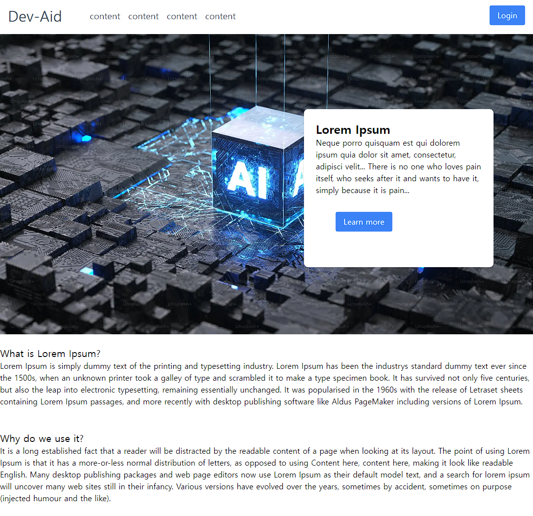
const Home: React.FC = () => (
<div className={StoriesWrapper.DEFAULT}>
<Feature
className={StoriesHero.DEFAULT}
imgSrc="https://plus.unsplash.com/premium_photo-1683121710572-7723bd2e235d?ixlib=rb-4.0.3&ixid=M3wxMjA3fDB8MHxwaG90by1wYWdlfHx8fGVufDB8fHx8fA%3D%3D&auto=format&fit=crop&w=1932&q=80"
altText="Image description"
imgWidth={1360}
imgHeight={640}
>
<Block
title="Lorem Ipsum"
button="Learn more"
className="absolute z-10 top-1/4 right-20"
buttonClassName="mt-8 mx-10"
>
<p>
Neque porro quisquam est qui dolorem ipsum quia dolor sit amet,
consectetur, adipisci velit... There is no one who loves pain itself,
who seeks after it and wants to have it, simply because it is pain...
</p>
</Block>
</Feature>
<div className={StoriesCol.DEFAULT}>
<Subtitle theme={SubtitleTheme.MEDIUM}>What is Lorem Ipsum?</Subtitle>
<p>
Lorem Ipsum is simply dummy text of the printing and typesetting
industry. Lorem Ipsum has been the industrys standard dummy text ever
since the 1500s, when an unknown printer took a galley of type and
scrambled it to make a type specimen book. It has survived not only five
centuries, but also the leap into electronic typesetting, remaining
essentially unchanged. It was popularised in the 1960s with the release
of Letraset sheets containing Lorem Ipsum passages, and more recently
with desktop publishing software like Aldus PageMaker including versions
of Lorem Ipsum.
</p>
</div>
<div className={StoriesCol.DEFAULT}>
<Subtitle theme={SubtitleTheme.MEDIUM}>Why do we use it?</Subtitle>
<p>
It is a long established fact that a reader will be distracted by the
readable content of a page when looking at its layout. The point of
using Lorem Ipsum is that it has a more-or-less normal distribution of
letters, as opposed to using Content here, content here, making it look
like readable English. Many desktop publishing packages and web page
editors now use Lorem Ipsum as their default model text, and a search
for lorem ipsum will uncover many web sites still in their infancy.
Various versions have evolved over the years, sometimes by accident,
sometimes on purpose (injected humour and the like).
</p>
</div>
</div>
);
export default Home;
기타
만들어둔 Layout은 _app.tsx 단위에서 적용하여 모든 페이지에서 표시되게 하였다.
이때 404페이지는 전체 페이지로 나오게 하기 위해 따로 eary return하도록 만들었다.
import '@/styles/globals.css';
import Layout from '@organisms/Layout';
import type { AppProps } from 'next/app';
import { useRouter } from 'next/router';

export default function App({ Component, pageProps }: AppProps) {
  const router = useRouter();
  const isCustom404 = router.pathname === '/404';

  if (isCustom404) {
    return <Component {...pageProps} />;
  }

  return (
    <Layout>
      <Component {...pageProps} />
    </Layout>
  );
}
완성 페이지
Reference: react-atomic-design-public-template
'Project > nomadia' 카테고리의 다른 글
| Nest.js logger middleware 테스트 (TDD) (2) | 2024.03.17 |
|---|---|
| 데이터 베이스 설계 (0) | 2023.09.17 |
| Nest.js - winston logger 적용하기 (0) | 2023.08.27 |
| Nest.js - config 설정 (0) | 2023.08.20 |
| TypeScript - const enum에서 as const로 변경 (0) | 2023.08.05 |